 Studio Elena
Honey drawn straight from the wild.
The identity is built on a single idea: the rarest luxury today is something untouched. Wildhive honey is raw, unfiltered and unpasteurized — gathered by bees left to forage across wild Alaskan meadows rather than driven to industrial fields.
The brand became a study in restraint: letting the product, the light and the land speak, and adding nothing that nature didn’t.
Honey branding usually shouts — cartoon bees, bright yellow, cheap gloss. Wildhive needed the opposite: a system confident enough to whisper. The challenge was to make raw and wild feel luxurious rather than rustic, and to hold that calm across every touchpoint — from a single jar to an outdoor campaign.
A skep and a serif. Heritage over hype — a mark built to age, not to trend.
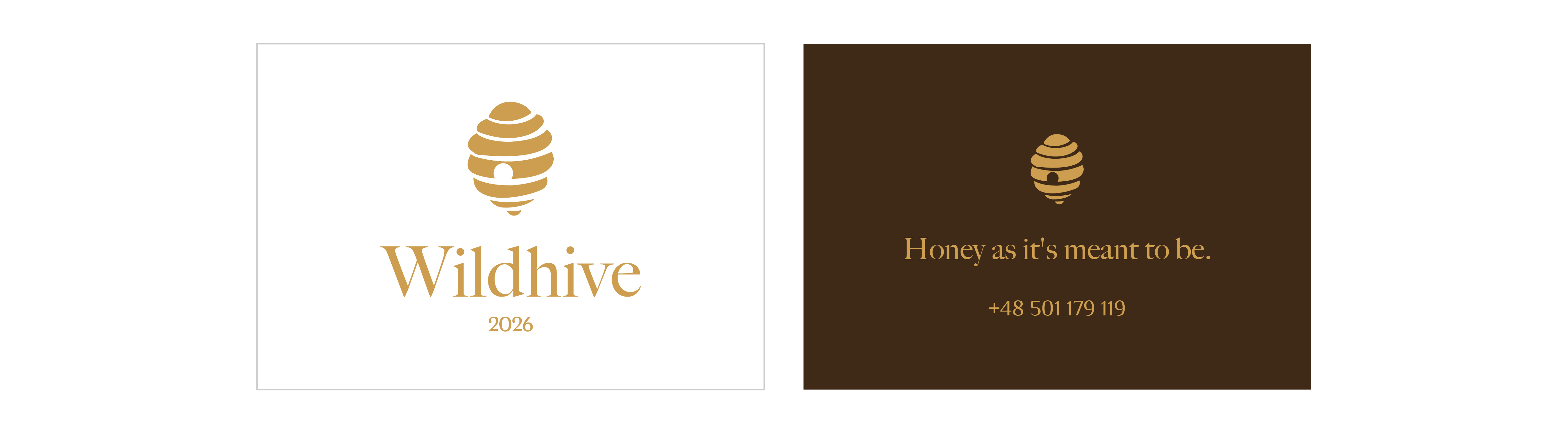
Quiet luxury. One serif, one gold mark, one earthy palette.
Every choice removes, never adds — the visual equivalent of unfiltered honey.
The label never wraps the jar. The honey stays visible —
proof of “unfiltered,” shown instead of claimed.
From a single hexagonal jar to an outdoor wall, every touchpoint holds the same calm. The light does the talking, the honey does the proving — nothing louder than it needs to be.
Wildhive is luxury measured in what was left out: no additives, no filtering, no noise. An identity as raw and unhurried as the honey it carries.
Nothing louder than it needs to be.